It’s time to find your best news designs, created and published in 2012. SNDS is now calling for entries to the Best of Scandinavian News Design awards. The deadline for submitting entries for both the online and the print competition is January 28, 2013.
Last year SNDS introduced the new “Scandinavia’s Best Designed Newspaper” award – this year there will also be a “Scandinavia’s Best Designed Online Media”, chosen from all the entries submitted. So what are you waiting for? Go find those great pages and urls and apps and other examples of visual journalism that you created last year – and be a winner!
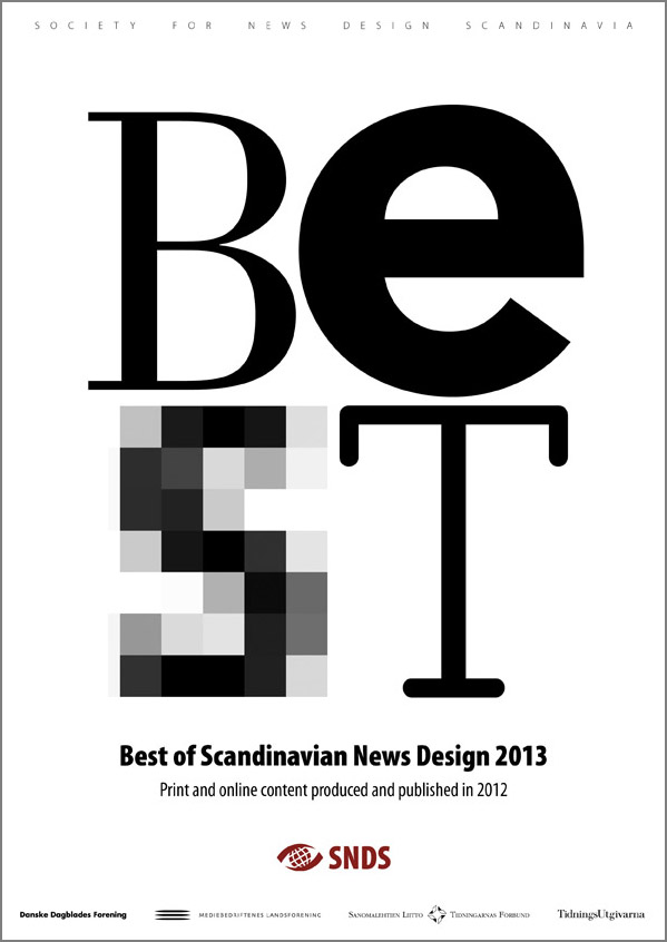
This year, I designed the cover of the competition booklet with a simple composition using the letters of the word BEST. The four different typefaces used signals the variety of the competition – from the good old printed newspaper (B) and the bold use of geometric magazine design (e) to the many digital possibilities of the online categories (S) and the typewriter font (T) representing the reader – as this kind of type often is used in comments or on opinion pages.
The B is AT Our Bodoni Light – which was released in 1989 and attributed to Massimo Vignelli (1931– ) after Giambattista Bodoni’s (1740–1813) design. Bodoni and other ‘modern’ typefaces like Didot appeared in the 1790ies introducing an extreme contrast between the fine strokes and the heavy stems of the letters. A very popular font for books for centuries, Bodoni was also many newspapers’ choice for headlines in the middle of the twentieth century (and still is in some places of the world). The light version used here was Morgenavisen Jyllands-Posten’s headline for feature sections up until as late as 2001, when Mario García and yours truely replaced it with Stone Serif.
The e is Avenir Black – designed by Adrian Frutiger and released by Linotype-Hell AG in 1988. The design is based on two earlier sans serif typefaces, Erbar and Futura. Avenir is unusual in that it has weights that are similar, but each is designed for a different purpose. Avenir has been and still is used in magazines as well as in the identity for the city of Amsterdam – and Apple uses Avenir for its Maps app and some Siri screens in iOS 6.
The S is a blown up version of Lucida Grande – as used on screen in the address field of my web browser. Lucida Grande a humanist sans-serif typeface, member of the Lucida family designed by Charles Bigelow and Kris Holmes. It has been used throughout Mac OS X user interface since 1999, as well as in Safari for Windows up to 2009. The two weights of this typeface are Regular and Bold, both included in Mac OS X and Safari.
The T is Berlingske Typewriter Light – the newcomer of the four, designed by Jonas Hecksher from the Danish type foundry e-Types for the relaunch of Denmark’s oldest newspaper Berlingske in January 2011. The Berlingske family includes Serif (6 styles), Sans (7 styles), Text (3 styles), Typewriter (3 styles), as well as a special Berlingske Dingbats font with logo treatment for editorial and commercial use. In May 2012 e-Types was awarded Gold at the Danish Creative Circle Awards in the Editorial Design category, for the font family and the redesign of the Berlingske nameplate.
—
The Best of Scandinavian News Design competition is organized by SNDS – Society for News Design Scandinavia – in cooperation with the four publishers’ associations: Danske Dagblades Forening (Denmark), Mediebedriftenes Landsforening (Norway), Sanomalehtien Litto (Finland), and TidningsUtgivarna (Sweden). The competition is open to all media in the Nordic countries, including Iceland and the Faroe Islands.
More info on snds.org/best