Five years ago, at the SNDS Copenhagen Crash seminar, the Norwegian newspaper VG‘s editor-in-chief Torry Pedersen told the audience that at VG they didn’t really care much about design, with a cacophony of different typefaces in the paper as a result.
This is, of course, in itself a design statement – as design is about so much more than a consistent choice of headline type. You need look no further than to VG Nett, which has been at the very top in recent years’ Best of Scandinavian News Design competitions.
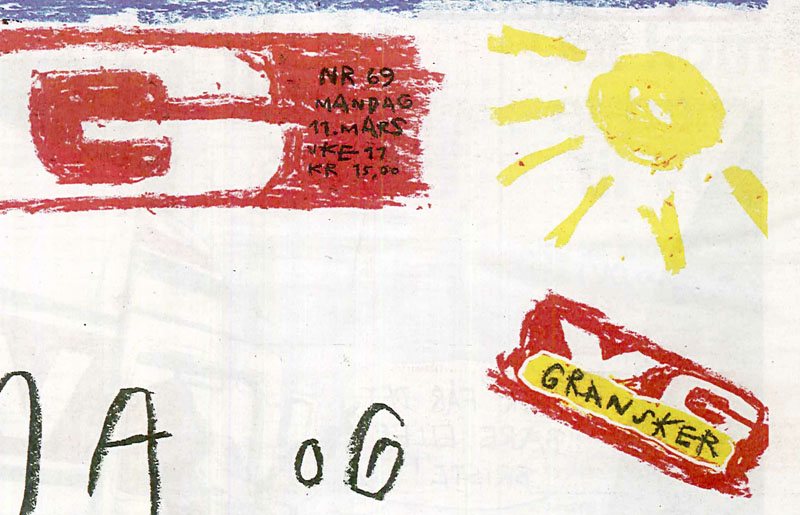
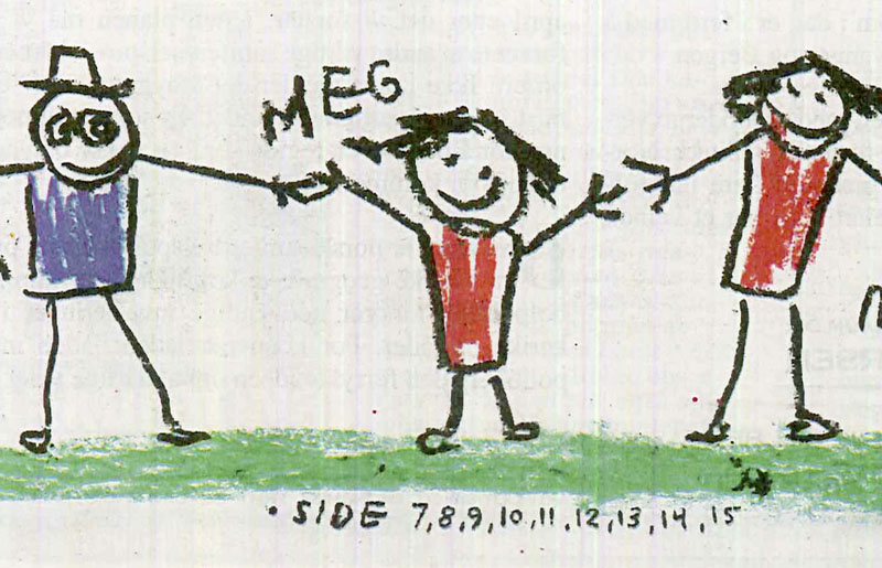
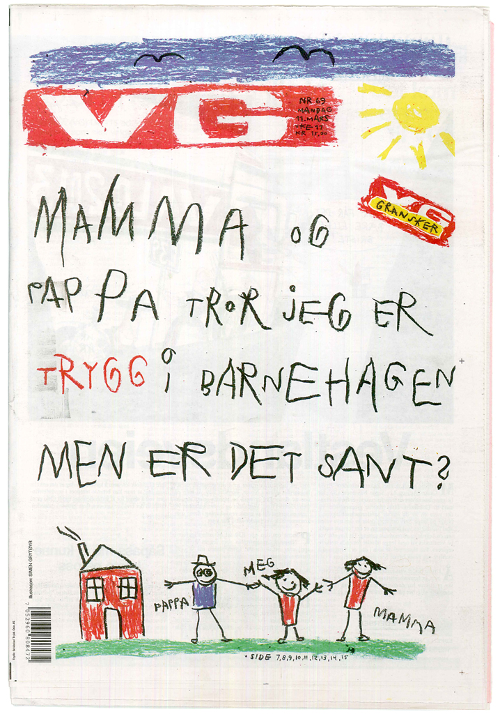
At VG they do, however, have the courage to treat their front page in ways that should inspire even the most ‘design consious’ newspapers and which matches the work of Politiken or Metropoli. This week’s Monday cover is a recent example. For a story about children feeling safe/unsafe in kindergarten, VG chose to turn the whole page into a hand drawn illustration – complete with nameplate, the special “VG gransker” logo, and promo page numbers created in children’s chalk. This may not be the perfect style book type setting, but for this occasion, the solution is nevertheless – just perfect.
PS. I’ve seen similar covers from VG almost as impressive as this, but with the ad in the bottom in ‘normal’ style. I’m looking forward to the day when an advertiser is willing to let VG give the ad the same treatment as the rest of the page. Or maybe that has already happened?