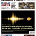
30
Apr 13

Håndarbejde Nu nomineret for design

Et opslag i tidsskriftet Håndarbejde Nu er nomineret i årets danske magasindesign-konkurrence, MDID No 03, der arrangeres af Foreningen for Magasindesignere i Danmark.

Continue reading →


27
Feb 13

News Design jury at work in Billund

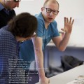
I’m in Billund, at Hotel Legoland, where the jury for the “Best of Scandinavian News Design 2013″ competition is meeting to find this years winners. 763 entries in the print categories and 65 in online will be judged by the hard working jury. The winners will be announced at the “WRONG…” seminar and workshop to be held in Copenhagen later in the year. See more on snds.org

Here are a few glimpses from the work of the jury, and a comment from Olli Nurminen, who is the chairman of the “Overall Design” category for print.

SNDS_Billund_2013_1798lowRickard Frank, Cilla Nilsson, Olli Nurminen, Tone Gilje.

SNDS_Billund_2013_1818lowRickard Frank, Stefani Urmas, Søren Nyeland, Cilla Nilsson.

SNDS_Billund_2013_1755lowWalter Jensen and Tone Gilje.

SNDS_Billund_2013_1832lowStefani Urmas’ hand, Politiken’s pages. Photos by Lars Pryds.


Olli Nurminen about SNDS judging from Lars Pryds on Vimeo. Interviewed and filmed by Søren S. Nielsen.


14
Feb 13

World’s Best Designed Newspapers announced

worldbestsnd34final“What distinguishes a World’s Best-Designed™ Newspaper? A culture of careful editing of all content that puts the reader first — through stringent attention to detail.”

“Too many designers are not driven by the content in front of them; they’re just moving elements around pages. In the best-designed publications, that connection jumps off the page.”

These were the words which SND, Society for News Design, today used to announce the winners in this year’s World’s Best Designed™ Newspapers competition. Scandinavia is – once again – among the winners: Politiken (DK) and Dagens Nyheter (S) wins the prestigious title alongside two German papers, Die Zeit and Welt am Sonntag, and The Grid from Canada.

It’s a first time for Dagens Nyheter, but Politiken also won in 2006 and 2011. Congratulations to all winners!

Read the full story on snd.org:
SND34 judges pick World’s Best-Designed™ Newspapers

Even though there were some great work shown also by runner-ups, the judges lament the absence of American papers among the winners, and see “another disturbing trend: the lack of illustration and especially information graphics in so many newspapers. These are the tools that newspapers can use to distinguish their content from the pack and add context and understanding to their report.”

In other words: Basic routine work may get the job done and the paper on to the streets, but it won’t win you any awards.

Here is what great news design looks like:
..


05
Jan 13

BEST news design 2012? (+ a little type info)

It’s time to find your best news designs, created and published in 2012. SNDS is now calling for entries to the Best of Scandinavian News Design awards. The deadline for submitting entries for both the online and the print competition is January 28, 2013.

Last year SNDS introduced the new “Scandinavia’s Best Designed Newspaper” award – this year there will also be a “Scandinavia’s Best Designed Online Media”, chosen from all the entries submitted. So what are you waiting for? Go find those great pages and urls and apps and other examples of visual journalism that you created last year – and be a winner!

Best 2013

This year, I designed the cover of the competition booklet with a simple composition using the letters of the word BEST. The four different typefaces used signals the variety of the competition – from the good old printed newspaper (B) and the bold use of geometric magazine design (e) to the many digital possibilities of the online categories (S) and the typewriter font (T) representing the reader  – as this kind of type often is used in comments or on opinion pages.

The B is AT Our Bodoni Light which was released in 1989 and attributed to Massimo Vignelli (1931– ) after Giambattista Bodoni’s (1740–1813) design. Bodoni and other ‘modern’ typefaces like Didot appeared in the 1790ies introducing an extreme contrast between the fine strokes and the heavy stems of the letters. A very popular font for books for centuries, Bodoni was also many newspapers’ choice for headlines in the middle of the twentieth century (and still is in some places of the world). The light version used here was Morgenavisen Jyllands-Posten’s headline for feature sections up until as late as 2001, when Mario García and yours truely replaced it with Stone Serif.

The e is Avenir Black designed by Adrian Frutiger and released by Linotype-Hell AG in 1988. The design is based on two earlier sans serif typefaces, Erbar and Futura. Avenir is unusual in that it has weights that are similar, but each is designed for a different purpose. Avenir has been and still is used in magazines as well as in the identity for the city of Amsterdam – and Apple uses Avenir for its Maps app and some Siri screens in iOS 6.

The S is a blown up version of Lucida Grande as used on screen in the address field of my web browser. Lucida Grande a humanist sans-serif typeface, member of the Lucida family designed by Charles Bigelow and Kris Holmes. It has been used throughout Mac OS X user interface since 1999, as well as in Safari for Windows up to 2009. The two weights of this typeface are Regular and Bold, both included in Mac OS X and Safari.

The T is Berlingske Typewriter Light the newcomer of the four, designed by Jonas Hecksher from the Danish type foundry e-Types for the relaunch of Denmark’s oldest newspaper Berlingske in January 2011. The Berlingske family includes Serif (6 styles), Sans (7 styles), Text (3 styles), Typewriter (3 styles), as well as a special Berlingske Dingbats font with logo treatment for editorial and commercial use. In May 2012 e-Types was awarded Gold at the Danish Creative Circle Awards in the Editorial Design category, for the font family and the redesign of the Berlingske nameplate.

The Best of Scandinavian News Design competition is organized by SNDS – Society for News Design Scandinavia – in cooperation with the four publishers’ associations: Danske Dagblades Forening (Denmark), Mediebedriftenes Landsforening (Norway), Sanomalehtien Litto (Finland), and Tidnings­Utgivarna (Sweden). The competition is open to all media in the Nordic countries, including Iceland and the Faroe Islands.
More info on snds.org/best


23
Nov 12

Fire guldmedaljer til håndholdt design

Der var guld til Arbejderen, Information, Politiken og Berlingske, da Danske Medier i går uddelte årets medaljer.

To forsider, fra hhv. Information og Politiken, fik guld i print-konkurrencen, mens der i “Årets Webavis” var guld til Arbejderen for hjemmesiden arbejderen.dk, og til Berlingskes iPad app. Bemærkelsesværdigt og positivt i denne digitale tidsalder er det at se, at de to printvindere begge bygger på håndtegnede – eller i Informations tilfælde håndskrevne – illustrationer.

Ud over de gyldne priser blev der uddelt sølv til Information, BT, Morgenavisen Jyllands-Posten og Politiken i print-konkurrencen og til Kristeligt Dagblad, Morgenavisen-Jyllands-Posten, BT, Politiken, Berlingske og to gange Ekstra Bladet i web-konkurrencen, samt hæder til 14 print-sider og fem web-sider.

Herunder de fire guldvindere – se alle vinderne på danskemedier.dk

Danske Medier er resultatet af en sammenslutning af en række foreninger for danske professionelle medier: Dansk Magasinpresses Udgiverforening (DMU), Danske Dagblades Forening (DDF), Danske Specialmedier (DS), Digitale Publicister (DP), Foreningen af Danske Interaktive Medier (FDIM), Radioerne og Ugeaviserne.


20
Nov 12

Berlingske wins European design awards

The winners in the 14th “European Newspaper Award” have been announced. 232 newspapers, six more than last year, from 25 countries took part in the competition.

The European Newspaper of the Year winners are, in the four categories:
Local newspaper: Bygdanytt, Norway; Regional newspaper: El Correo, Spain; National newspaper (two winners this year): De Tijd, Belgium and Trouw, the Netherlands; Weekly: Die Zeit, Germany.

A Judges’ Special Recognition was awarded to Welt am Sonntag, Kompakt, Germany.

Berlingske, winner of the European Newspaper of the Year 2012, was among the multiple winners in this years competition. Berlingske took home a total of 12 Awards of Excellence in different categories: Front page, Photo spreads and Visual storytelling, Visualization as well as in the magazine categories. Below are some of the pages the jury found worthy of an award this year. I’m pleased to see that “my” magazine, Berlingske Business Magasin, is a two-time winner!

Winner in the Front Page category 02/09/2012.

Winner in Photography Picture Page. Photo by Niels Ahlmann Olesen. 26/08/2012

Winner in Visualization category – Diet Coke turns 30. 23/09/2012. Design by Henriette Vabø.

Berlingske Business Magasin – winner in the Magazines category. 16/02/2012. Photo by Morten Germund.

Magazines. Berlingske Business Magasin 29/03/2012. Illustration by Pryds, with a little help from Colourbox :-)

Magazines. Berlingske Business Magasin 29/03/2012.

See the full list of winners and more info at newspaperdesign.de


13
May 12

SNDS Magazine nominated in design competition

An article about the terror attack on Norway on 22 July 2011 has been nominated in the Danish competition for magazine design, MDID 02. The ten pages, entitled “Norway under attack”, was published in SNDS Magazine 3, 2011, show examples of how Scandinavian newspapers chose to report the tragedy on their cover page in the first few days after the event. The article is nominated in the category “Trade or Special Magazine of the Year”. Continue reading →