BOGANMELDELSE: Mario Garcías 14. bog med titlen “The Story” udkommer nu i tre bind – en e-bogsudgivelse i mobiltelefonlayout omsat til gammeldags print. Bind 1 får tre af fem stjerner. Fra Journalisten.
Kategori: News design
JP Explorer kører igen
Så kører JP Explorer sgu igen! Jyllands-Posten tager i påsken ud i verden og rapporterer med fokus på klimaet. Lidt sjovt, at en god, gammel idé sådan dukker op påny – omend i noget mindre målestok, end da JP den 19. august 1998 sendte en firehjulstrækker rundt i (bogstaveligt talt) hele verden på 500 dages …
En hyldest til avisdesign
BOGANMELDELSE: "Newspaper Design" argumenterer for, at nye medieformater aldrig vil erstatte de gamle – i stedet vil de forskellige formater tilpasse sig og leve side om side – og bidrage med hver sin helt særlige stemme. Fra Journalisten
JP’s nye flagskib om søndagen
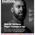
DESIGN: JP's flagskib om søndagen, Indblik, er fusioneret med Kulturweekend. Det nye tillæg Indblik Weekend er en skarpere og mere moderne avis-sektion.
Nyt dagblad fra JP – i Pryds-design
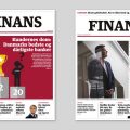
AVISDESIGN: Finans.dk udgiver nu også FINANS – et dagblad, der layoutes og redigeres i klassisk avisformat, men udgivet som en e-avis, der kan læses på smartphone, tablet eller computer. Lars Pryds har designet.