Kære alle – tak for godt samarbejde og samvær i 2019. Man skal se frem, siger de kloge, ikke fortabe sig i det, der allerede er fortid. En af de virkelig kloge, Søren Kierkegaard, sagde dog, at “Livet maa forstaaes baglænds” – omend leves forlæns. Så årets hilsen er en collage af bogstaver fra nogle …
Tag: News design
En hyldest til avisdesign
BOGANMELDELSE: "Newspaper Design" argumenterer for, at nye medieformater aldrig vil erstatte de gamle – i stedet vil de forskellige formater tilpasse sig og leve side om side – og bidrage med hver sin helt særlige stemme. Fra Journalisten
JP’s nye flagskib om søndagen
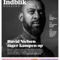
DESIGN: JP's flagskib om søndagen, Indblik, er fusioneret med Kulturweekend. Det nye tillæg Indblik Weekend er en skarpere og mere moderne avis-sektion.
Nyt dagblad fra JP – i Pryds-design
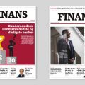
AVISDESIGN: Finans.dk udgiver nu også FINANS – et dagblad, der layoutes og redigeres i klassisk avisformat, men udgivet som en e-avis, der kan læses på smartphone, tablet eller computer. Lars Pryds har designet.
Sølv i Årets Avisside
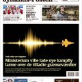
DESIGN: Lars Pryds vinder sølvmedalje i konkurrencen "Årets Avisside", for en forsideillustration tegnet til Jyllands-Posten.