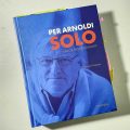
30
Apr 13

Håndarbejde Nu nomineret for design

Et opslag i tidsskriftet Håndarbejde Nu er nomineret i årets danske magasindesign-konkurrence, MDID No 03, der arrangeres af Foreningen for Magasindesignere i Danmark.

Continue reading →


25
Apr 13

Berlingske iPad – og grafik

Berlingske Aften er Berlingskes klokken 17-udgave – unikt indhold, kun på iPad’en. Dr. Mario R. García, som er verdens formentlig største kapacitet inden for nyhedsdesign, har netop kigget nærmere på iPad-app’en på sin The Mario Blog, og synes blandt andet, at app’en har den rette kombination af nyhedspræg og en mere tilbagelænet billedbåret fortællestil.

Continue reading →


27
Feb 13

News Design jury at work in Billund

I’m in Billund, at Hotel Legoland, where the jury for the “Best of Scandinavian News Design 2013″ competition is meeting to find this years winners. 763 entries in the print categories and 65 in online will be judged by the hard working jury. The winners will be announced at the “WRONG…” seminar and workshop to be held in Copenhagen later in the year. See more on snds.org

Here are a few glimpses from the work of the jury, and a comment from Olli Nurminen, who is the chairman of the “Overall Design” category for print.

SNDS_Billund_2013_1798lowRickard Frank, Cilla Nilsson, Olli Nurminen, Tone Gilje.

SNDS_Billund_2013_1818lowRickard Frank, Stefani Urmas, Søren Nyeland, Cilla Nilsson.

SNDS_Billund_2013_1755lowWalter Jensen and Tone Gilje.

SNDS_Billund_2013_1832lowStefani Urmas’ hand, Politiken’s pages. Photos by Lars Pryds.


Olli Nurminen about SNDS judging from Lars Pryds on Vimeo. Interviewed and filmed by Søren S. Nielsen.


05
Jan 13

BEST news design 2012? (+ a little type info)

It’s time to find your best news designs, created and published in 2012. SNDS is now calling for entries to the Best of Scandinavian News Design awards. The deadline for submitting entries for both the online and the print competition is January 28, 2013.

Last year SNDS introduced the new “Scandinavia’s Best Designed Newspaper” award – this year there will also be a “Scandinavia’s Best Designed Online Media”, chosen from all the entries submitted. So what are you waiting for? Go find those great pages and urls and apps and other examples of visual journalism that you created last year – and be a winner!

Best 2013

This year, I designed the cover of the competition booklet with a simple composition using the letters of the word BEST. The four different typefaces used signals the variety of the competition – from the good old printed newspaper (B) and the bold use of geometric magazine design (e) to the many digital possibilities of the online categories (S) and the typewriter font (T) representing the reader  – as this kind of type often is used in comments or on opinion pages.

The B is AT Our Bodoni Light which was released in 1989 and attributed to Massimo Vignelli (1931– ) after Giambattista Bodoni’s (1740–1813) design. Bodoni and other ‘modern’ typefaces like Didot appeared in the 1790ies introducing an extreme contrast between the fine strokes and the heavy stems of the letters. A very popular font for books for centuries, Bodoni was also many newspapers’ choice for headlines in the middle of the twentieth century (and still is in some places of the world). The light version used here was Morgenavisen Jyllands-Posten’s headline for feature sections up until as late as 2001, when Mario García and yours truely replaced it with Stone Serif.

The e is Avenir Black designed by Adrian Frutiger and released by Linotype-Hell AG in 1988. The design is based on two earlier sans serif typefaces, Erbar and Futura. Avenir is unusual in that it has weights that are similar, but each is designed for a different purpose. Avenir has been and still is used in magazines as well as in the identity for the city of Amsterdam – and Apple uses Avenir for its Maps app and some Siri screens in iOS 6.

The S is a blown up version of Lucida Grande as used on screen in the address field of my web browser. Lucida Grande a humanist sans-serif typeface, member of the Lucida family designed by Charles Bigelow and Kris Holmes. It has been used throughout Mac OS X user interface since 1999, as well as in Safari for Windows up to 2009. The two weights of this typeface are Regular and Bold, both included in Mac OS X and Safari.

The T is Berlingske Typewriter Light the newcomer of the four, designed by Jonas Hecksher from the Danish type foundry e-Types for the relaunch of Denmark’s oldest newspaper Berlingske in January 2011. The Berlingske family includes Serif (6 styles), Sans (7 styles), Text (3 styles), Typewriter (3 styles), as well as a special Berlingske Dingbats font with logo treatment for editorial and commercial use. In May 2012 e-Types was awarded Gold at the Danish Creative Circle Awards in the Editorial Design category, for the font family and the redesign of the Berlingske nameplate.

The Best of Scandinavian News Design competition is organized by SNDS – Society for News Design Scandinavia – in cooperation with the four publishers’ associations: Danske Dagblades Forening (Denmark), Mediebedriftenes Landsforening (Norway), Sanomalehtien Litto (Finland), and Tidnings­Utgivarna (Sweden). The competition is open to all media in the Nordic countries, including Iceland and the Faroe Islands.
More info on snds.org/best


03
Jan 13

1-2-3, nu kommer muren!

De tre store danske dagblade har erkendt, at det bliver nødvendigt at tage betaling for nyheder på nettet. Som inspiration til videre læsning er her tre hurtige pluk fra de seneste dages publikationer om emnet – fra nettet, selvfølgelig. (To var ovenikøbet illustreret med det samme foto, indtil en af dem skiftede billedet ud …)

1. januar:
quoteVi kommer helt sikkert til at se flere betalingsmure rundt om netaviser, også på lokale og regionale medier, men spørgsmålet er, hvor mange der er villige til at betale for noget, der har været gratis i årevis. Nok ikke mange.
– Ida Willig, RUC, i en kommentar på b.dk

2. januar:
quoteUdfordringen for en avis er at skabe unikt egenproduceret indhold, som brugerne er villige til at betale for. Og så […] er der selve problemet med journalistik som vare.
– Mikkel Vuorela, på politiken.dk

3. januar:
quoteDet digitale skift er en evolutionær forandring snarere end revolutionær, og både aviser og kunderne skal finde ud af, hvad de hver især vil have og har behov for.
– Robert Picard, Oxford University, på epn.dk

medieaaret2013

Læs også:
“I’m building a wall” – om de skandinaviske tiltag. Fra SNDS Magazine.


21
Dec 12

I’m building a wall*

Making people pay for news on the web and other digital platforms has been doomed impossible by media researchers, but that does not keep anyone from trying.

By Lars Pryds / From SNDS Magazine 4, 2012.

It certainly looks like a new trend for Scandinavian media houses: setting up paywalls on their websites and preparing special paid-for digital products.

As Anders Tapola writes on the back page of this magazine, Fædre­landsvennen in Norway has started charging for Everything, Everywhere, Always. An easy-to-understand strategy – click any link on the front page of fvn.no and you will be prompted to pay for access to the journalistic content.

In Denmark Berlingske did the same in November for a handful of its regional newspapers, so readers who want to read local news from e.g. Aarhus Stiftstidende will have to pay for it, whether it’s in print or online.

Building a wall – but a soft one
However, most media houses do not have the courage to go all the way and charge for everything, but allow a certain amount of content for free before you have to punch in those numbers from your credit card. Also in November, in Finland, the mighty Helsingin Sanomat built a ‘soft’ paywall for hs.fi – allowing five free articles per week.

In Sweden, several papers have tried the same, says SNDS President Anders Tapola. Dagens Nyheter has launched a new website, dagensnyheter.se, where all material from the print edition is published at one o’clock every night – to complement the fast news updates on the regular dn.se.

“However, most of the initiatives look rather half-heartedly,” says Tapola, “and in some cases it’s difficult to understand what you’re paying for.”

Just like the New York Times
The three major national papers in Denmark all seem to be going the same way as Helsingin Sanomat – Politiken has chosen “the Metered Model which New York Times were the first to launch 18 months ago and which 150 US newspapers have rolled out since. We will launch our model in the new year,” says Anders Emil Møller, head of digital development at Politiken.

Berlingske will do the same – also “in the new year” (probably in February) – allowing 10 clicks for free each month before charging for articles. A complete reorganization of the way news stories will be planned are in the works – in order to publish all content to all platforms.

Jyllands-Posten has introduced a slightly different model for charging for online content in the form of a ‘Premium’ product, which will give subscribers access to content of a ‘special quality’.

The times are certainly changing (again) for the news media – and this is how it should be. Dr. Mario R. García – a die-hard optimist on behalf of the news business – phrased it very clearly in Cleveland, at the SND workshop:

“There is a place even for print – but those who survive are the ones who rethink themselves”.

An impossible task?
But, will the news companies survive by introducing paid-for web content? Not everyone is as optimistic as García. Erik Rasmussen, CEO and publisher, Monday Morning Management (DK), thinks that this project is impossible – for two reasons:

“Firstly, no matter what kind of paywalls the dailies set up, there will be an abundance of free news on the web. Second­ly, the newspapers have neglected to develop the originality and use value that the readers are willing to pay for.” (Berlingske, 22 Oct. 2012).

So, maybe all the hard work should not start with preparations for publishing your contenton a multitude of platforms in hundreds of different shapes and sizes, or trying to keep up with your competitors by doing exactly the same as they do. Instead, it might be a good idea to rethink the content itself.

As García also said in Cleveland – the story comes first, not the platform.

* I’m building a wall
a fine wall
not so much to keep you out
more to keep me in
– Pet Shop Boys (2009)


STOP! Even though you don’t understand a word of Finnish, the message of this warning sign is easily recognizable: Pay, if you want to continue. If you’re already a subscriber to Helsingin Sanomat in print, you’re only a little bit more lucky – you still have to pay, but the price will be as low as 3 euros per month, less than a third of the price for new readers. (Screenshot from hs.fi)

dagensnyheter.se – the printed paper, online.

fvn.no – pay for news Everything, Everywhere, Always.

stiften.dk – local news behind iron curtains.


13
Dec 12

SNDS Magazine no. 4 has hit the streets

There’s a lot of great stuff in this year’s last SNDS Magazine, which has just been published on the snds.org website and is on its way (in hard copy) to members and subscribers.

We have great photos from SNDS and SND workshops in Copenhagen, Denmark, and in Cleveland, Ohio. We also look at paid for news on the web; at infographics that unite the world; the results from Poynter’s iPad Eyetrack research; the recently redesigned USA Today; and the new exciting possibilities in the SNDS competition. And much more!